The process to create treemaps in Tableau using the Show Me menu is the same as for creating pie charts. The only difference is that rather than clicking on the pie chart icon, you should click on the treemaps icon as shown in Figure 4.38:
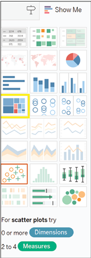
Figure 4.38: Creating treemaps in Tableau is just like creating pie charts, but with a treemaps icon
In this case, rather than using Expected Amount, we will be using Amount. Following the same steps as before, this is the final chart, as shown in Figure 4.39:
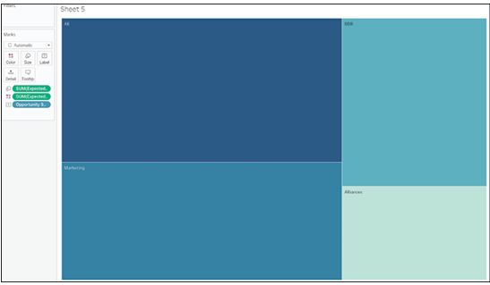
Figure 4.39: Final chart showing the usage of “Amount” instead of “Expected Amount”
Just as before, we will change from the total amount to the average amount and add more information to the chart to benefit the reader. The final result is shown in Figure 4.40:
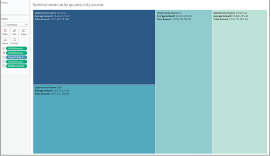
Figure 4.40: Chart displaying total and average amounts, enhanced with additional information
Just as in the previous case, it would seem that average amount is the same, but some sources generate more opportunities.
Looking at Opportunities Source gave us some insights, but we want to understand more about where our revenues are coming from, so we will look at Lead Source instead and compare expected revenues with nominal revenues in a scatter plot.
To create a scatter plot in Tableau, start by dragging one of your measures to Rows as shown in Figure 4.41:

Figure 4.41: Scatter plot creation in Tableau: Dragging a measure to Rows
Drag the other measure to Columns as shown in Figure 4.42:

Figure 4.42: Drag the measure to Columns
Drag the dimension used to breaking down your measures to Detail. In this case, we want to compare revenues by Lead Source, so Lead Source is the field we will add to Detail as shown in Figure 4.43:
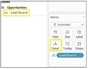
Figure 4.43: Breaking down measures by Lead Source in a dimension drag
You now have your scatterplot as shown in Figure 4.44:
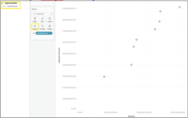
Figure 4.44: Visualization of the scatterplot
Just as before, to better aid comprehension, the chart can be customized. To add the name of the lead source to the chart, drag Lead Source to the Label mark as shown in Figure 4.45:
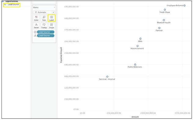
Figure 4.45: Adding lead source to the chart for better comprehension
To further differentiate, drag Lead Source to the Color mark. Each circle now has a different color as shown in Figure 4.46:
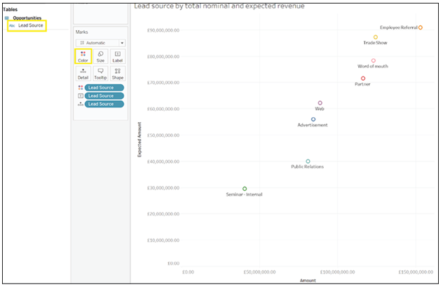
Figure 4.46: Differentiating lead sources by dragging to the mark, resulting in varying circle colors
It is also possible to choose which shape to display in the chart. To do so, click on the Shape mark. You will now see a selection of shapes from which you can choose your favorite as shown in the Figure 4.47:
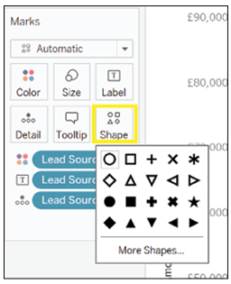
Figure 4.47: Choosing a shape for the chart
Here, we chose to replace circles with dots as shown in Figure 4.48:
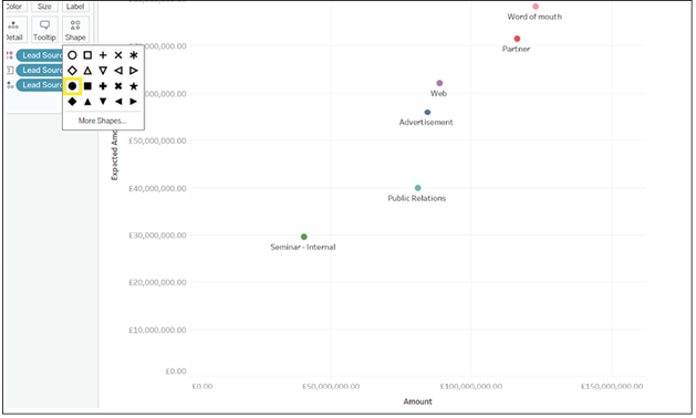
Figure 4.48: Circular shapes transformed into dots
When comparing totals, unsurprisingly, there is a strong positive correlation between expected revenues and nominal revenues, so the higher the amount in our pipeline, the higher the amount we expect to convert into actual revenues. We can further confirm this by adding a trend line to the chart. To add a trend line, click on the Analysis menu as shown in Figure 4.49:

Hover on Trend Lines as shown in Figure 4.50:
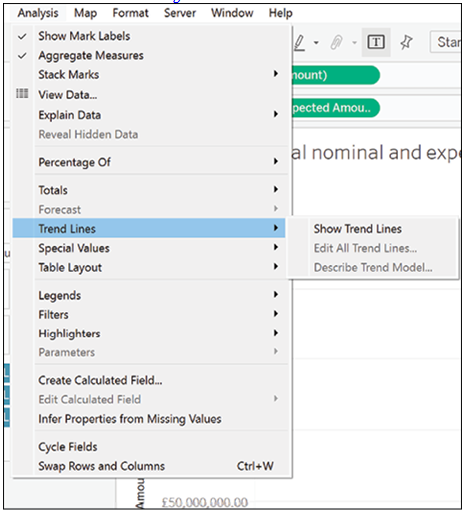
Figure 4.50: Visualizing trends
Click on Show Trend Lines as shown in Figure 4.51:
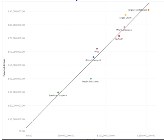
Figure 4.51: Analyzing trends with the click of a button
This is not the full story though, so we will now compare the average expected amount with the average nominal amount. Following the same steps as before, including the customization, the final chart can be seen in Figure 4.52:
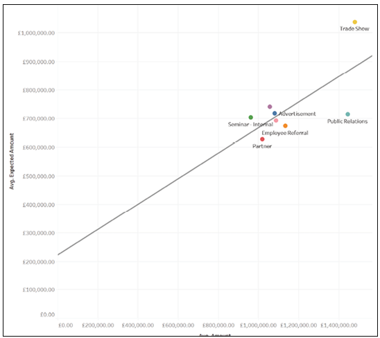
Figure 4.52: Comparing average expected and nominal amounts
Comparing these two charts reveals that some sources bring in higher quality opportunities than others. For example, the two sources that bring in the largest amounts of opportunities, tell a different story when comparing averages. Trade shows bring in more opportunities which are also more likely to realize as concrete revenues. However, opportunities brought in via employee referrals, while many, are less likely to close than they should be. Finally, opportunities brought in via Public Relations are fewer and less likely to close, so we may want to review our strategy there.