Fundamentals of creating visualizations in Tableau – Exploring Charts, Graphs, and Dashboards

This section aims to equip you with the fundamental knowledge and techniques needed to navigate Tableau’s interface and leverage its capabilities to create compelling visualizations. Starting with the Data Source screen and moving into the creation of various chart types, we will explore key concepts such as Sheets, Dashboards, Dimensions, Measures, and more. By understanding these foundational elements, you will be well on your way to effectively visualizing your data, from basic charts to more complex analyses. Whether you are analyzing customer data, tracking campaign performance, or exploring financial metrics, this guide provides a step-by-step approach to harnessing Tableau’s potential to uncover valuable insights hidden within your data.

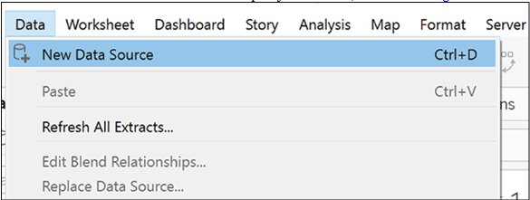
Now that you have fixed your data to the best possible quality, it is time to start visualizing it. From the Data Source screen, click on Sheet 1. This is the working space where you will create your visualizations. Before we start, it is useful to get acquainted with the following terminology:

  • Sheet/Worksheet: A sheet is a container for each chart in Tableau. Each chart requires a different sheet. We will use the terms sheet and worksheet interchangeably.
  • Dashboard: A collection of sheets displayed at the same time covering related information.
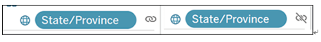
  • Dimensions: These are the categorical variables or the fields you will want to use to slice and dice your data. An example of a dimension can be color, country, name, or surname. Dimensions in Tableau, are blue.
  • Measures: These are the numerical variables, that is, the actual numbers you want to show. For example, sales, number of customers, or profit. Measures in Tableau are green.
  • Field: It is either a dimension or a measure. This word will be used when the dimension/measure distinction does not matter.
  • Mark: Every single point in your visualization is a mark. Each bar in your bar chart, each dot in a scatter plot, and each value in a table is a mark.

Now that we have clarified the basics let us take a look at some of the areas in Figure 4.1:

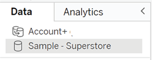
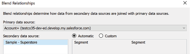
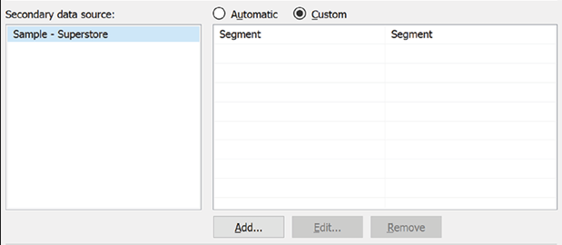
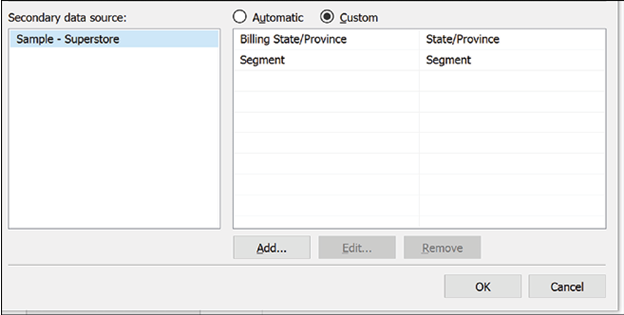
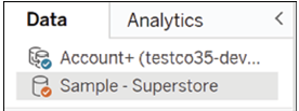
  1. Data: This shows the data source being used currently. When you start using several data sources across several sheets, it is always a good idea to check that the one you are using in each sheet is correct.
  2. Fields area: This lists all your dimensions and values, which you will use to create your visualizations. At the top, there is a handy filter box for searching a specific field.
  3. Columns/Rows: This is where you will drag your fields to create your visualizations. Different dimensions and measures in different columns/rows arrangements give different charts.
  4. Filters: Every field you use to filter your data, will be shown in this area.
  5. Marks: Here is where you control the aspect of your charts. From here, you can select color, size, and how your labels should look. This area will become increasingly useful as we look into intermediate and advanced charts.
  6. Show me: This is the menu helping beginner users create their charts. Once you stop relying on this menu, you know you will have succeeded in the task of learning to use Tableau.
  7. New Worksheet/Dashboard/Story: Clicking on each of these buttons will create new sheets/dashboard/stories.
  8. Chart area: This is where you will see your visualization. You can also drop fields in this area rather than in the columns/rows area to create charts.

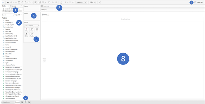
Figure 4.1: Chart area: Visualize and create charts by dropping fields in this area

Unions – Building and Integrating Data Pipelines

It is not possible to union data using the Salesforce connector, so the steps below will only be available if you are connecting to your Salesforce data via a database connection as shown in the section Connecting to your Salesforce data in SQL.

A union works differently from the methods shown above in that, rather than adding columns from different data sources, it adds rows to existing data. In order for unions to work, all data objects must have the same structure.

The steps to perform in this case are the following:

  1. Connect to the database as shown in the section Connecting to your Salesforce data in SQL.
  2. Drag the New Union button to the main data area, as shown in Figure 3.34:

Figure 3.34: Adding a new union in Tableau

  1. A menu will open, as shown in Figure 3.35:

Figure 3.35: Creating union

  1. Drag here all the objects to be unioned. Tableau will read the structure of the first object and expect all objects to follow the same structure, as shown in Figure 3.36:

Figure 3.36: Selecting data sources to union in Tableau

  1. If Tableau encounters no problem in unioning the data, you will see the final dataset at the bottom of your screen.
  2. You can always add or remove objects by clicking on the caret on your union and clicking Edit Union, as shown in Figure 3.37:

Figure 3.37: Final unioned dataset shown in Tableau

  1. The same menu will open. From this same menu you can specify whether the field names are in the first row of your data or whether Tableau should generate field names automatically. The option to choose will depend on how your data is structured.

Conclusion

In this chapter, we have explored various methods for connecting to data in Tableau and delved into the software’s data cleaning and transformation capabilities. You have learned how to connect to Salesforce data using the Salesforce Connector and how to authenticate and configure the connection successfully.

We also discussed connecting to data that has been exported to an SQL database and highlighted scenarios where this method may be beneficial. Furthermore, we have equipped you with the skills to manipulate data in Tableau using techniques such as pivot, join, and split once the data is loaded into the software.

In addition, we have covered managing data sources in Tableau, including connecting to multiple data sources, creating data source filters, and crafting calculated fields. With the knowledge and skills gained from this chapter, you are better prepared to effectively connect to, clean, and transform data in Tableau for enhanced data analysis and visualization. This will ultimately enable you to make more informed decisions and drive impactful insights from your data.

In the next chapter, we will delve into the core functionality that makes Tableau such a powerful visualization tool.

1 Disclaimer: You may not be able to see the color of the ticks change if you have brought a paperback version of the book. However, you can access the colored version of the image at the link given at the beginning of the book.

Blends – Building and Integrating Data Pipelines

Data blends are useful in the case of data sources that have a limited relationship to each other and are used together for only some parts of the analysis and are kept separate for the remainder.

To blend a data source, follow these steps:

  1. Add a data object to the main area.
  2. Go to your visualization sheet.
  3. Click on the Data menu at the top of your screen, as shown in Figure 3.23.

Figure 3.23: Accessing the Data menu in Tableau

  1. Click on New Data Source.
  2. Select the desired data source type and follow the prompts. For this example, we have chosen the Salesforce Superstore data, as shown in Figure 3.24:

Figure 3.24: Adding a new data source in Tableau

  1. You will now see two different data sources in the top left corner of your data menu, as shown in Figure 3.25:

Figure 3.25: Two different data sources are visible after adding a new one

It is now time to define how the data sources should be blended. In order to do so:

  1. Click on the Data menu at the top of your screen.
  2. Click on Edit Blend Relationships. A menu will now open, as shown in Figure 3.26:

Figure 3.26: Editing blend relationships in Tableau

  1. In the menu, select which of your data sources should be the primary one. A good rule of thumb is the data source from which you will be taking the most fields, as shown in Figure 3.27:

Figure 3.27: Selecting the primary data source for a blend in Tableau

  1. Below the primary data source selector, you will see a list of fields.
    Tableau will try to populate those whenever possible. However, if these fields are incorrect or missing, you can adjust them by following these steps, as shown in Figure 3.28:

Figure 3.28: Defining relationships between fields in a Tableau data blend

  1. Select Custom from the Automatic/Custom selector.
  2. Click on a field (if present).
  3. Choose one of the options in the menu at the bottom:
    • Add: To establish a relationship between two fields.
    • Edit: To edit the relationship between two fields.
    • Remove: To remove the relationship between two fields.
  4. Clicking on any of these options will open a menu from where you can pick a field from the primary data source list and its counterpart in the secondary data source field
  5. In this case, we have added the Billing State/Province from Salesforce and matched it with State/Province in the Salesforce data. We have also kept the Segment to Segment match, as shown in Figure 3.29:

Figure 3.29: Mapping fields between two data sources to create a Tableau data blend

  1. Click on OK.
  2. If your blend is successful, you will notice the following changes:
    • Your primary data source has a blue tick next to its name.
    • Your secondary data source has an orange tick to its name, as shown in

Figure 3.30: Indicators of a successful Tableau data blend

  • The field(s) used for the blend have a chain icon next to their name.

You can turn the blend on and off by clicking the chain icon. Two linked chain rings indicate that the blend is currently active, and a barred chain icon indicates a currently inactive blend, as shown in Figure 3.31:

Figure 3.31: Chained versus barred chain icons indicating blend status

Troubleshooting tip

If you cannot see the changes, start dragging fields into the main visualization area. Tableau will treat the data source containing the first field you will use in the visualization as the primary one. For example, here, we have started by dragging the Industry field from the Salesforce data and only afterward added the Segment field from Superstore. So now you can see a blue tick next to Salesforce, as shown in Figure 3.32:

Figure 3.32: Tableau interpreting the first visualized field’s data source as primary in a blend

In this case, we started with the Superstore data and dragged Salesforce data afterward. The blue tick is now on the Superstore data, and the orange is on Salesforce, as shown in Figure 3.33:

Figure 3.33: Tableau interpreting the first visualized field’s data source as primary in a blend1

Blends work regardless of the data source type, as you can see in this case, where the Salesforce data is being blended with the standard Tableau Superstore data, which comes as an Excel .xls file. They are a good solution when dealing with different data types, as in this case, but can quickly encounter performance issues.

Relationships – Building and Integrating Data Pipelines

Introduced in 2020.2, relationships are a new way of connecting different data objects. While joins happen on the physical layer of the data source, relationships happen at the logical layer. This means that there is no new data source created, and Tableau will automatically handle duplicates and null values.

Relationships are the default way used by Tableau to connect data objects. Therefore, the process of using relationships requires fewer steps than joins. To start using relationships with your tables, follow these steps:

  1. Drag a table from the left side of the screen.
  2. Drag the second table you wish to join from the left side of the screen.
  3. If Tableau has enough information, it will set up an automatic relationship.
  4. If Tableau cannot establish a relationship automatically, it will highlight the problem just as it finds a link. It will highlight the problem with a triangle, as shown in Figure 3.20:

Figure 3.20: Tableau indicating it cannot automatically create a relationship between two tables

  1. If that is the case, you can use the menu at the bottom of your screen to specify which fields should be used to establish the relationship.
  2. Just as before, the join is configured so that Tableau can use the table Account with the table Contact by using the field Account ID present in both tables but labeled as Account ID (Contact) in the Contact table, as shown in Figure 3.21.

Figure 3.21: Manually defining the relationship in Tableau using the relationship editor

  1. As you can see, the red triangle mark has disappeared, and the two tables are now joined. This process can be repeated on as many objects as necessary. Simply drag any additional table into the join area, as shown in Figure 3.22, and proceed with the steps defined above.

Figure 3.22: Multiple tables successfully related in Tableau

To remove a table, follow the same steps outlined in the Joins section.

Joins versus relationships

At first glance, it may seem that relationships and joins are quite similar, if not identical. However, there are differences in their substance and behaviors worth understanding to decide which option to use.

The obvious advantage of relationships is that they do not require any prior understanding of SQL-like join behavior, which makes them a great option for beginner users. Advanced users, however, may prefer the additional degree of flexibility that comes from defining which type of join to employ and which fields to use.

It is also worth mentioning that relationships may not work as intended for data where the quality is exceptionally poor and may cause performance issues if large quantities of data are needed.