Pie charts in Tableau – Exploring Charts, Graphs, and Dashboards

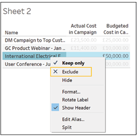
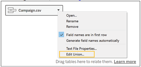
The easiest way to create pie charts and tree maps in Tableau is to use the Show Me menu (an alternative way to create pie charts will be discussed in the next chapter). For this example, we will be using the Opportunities data which can be found under the Standard Connection tab in the data menu as shown in Figure 4.21:

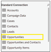
Figure 4.21: Tableau’s Show Me menu simplifies the creation of diagrams

Disclaimer: Pie charts become hard to read when they are split into more than two categories, and the same information can be represented in other charts, which take up less screen space, so please use them sparingly.

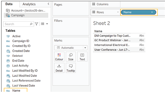
To start, double-click on Opportunity Source in the Dimensions menu as shown in Figure 4.22. Tableau will automatically add it to Rows.

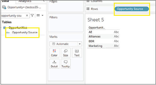
Figure 4.22: Opportunity source

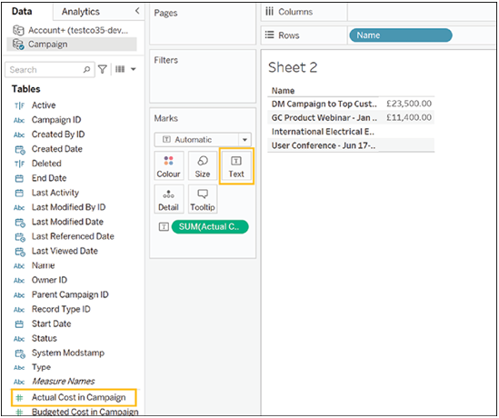
Next, double-click on Expected Amount. Tableau will automatically add it to the Label mark as shown in Figure 4.23:

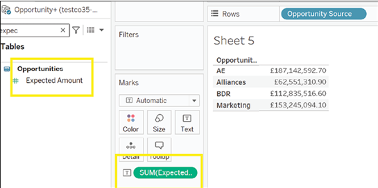
Figure 4.23: Tableau adds Expected Amount to Label mark.

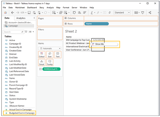
Finally, click on the Show Me menu and select the pie chart visualization from the menu as shown in Figure 4.24:

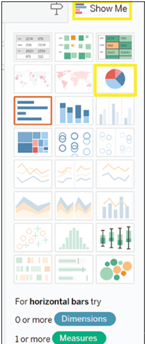
Figure 4.24: Choosing the pie chart from the Show Me menu

Tableau will now create a pie chart for you, as shown in Figure 4.25:

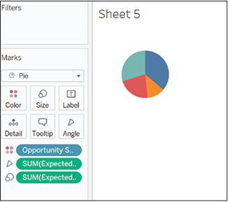
Figure 4.25: Tableau effortlessly creates a pie chart

However, this pie chart is not very informative, so let us try and add more information. Clicking on the Size mark will allow us to resize the pie chart as shown in Figure 4.26:

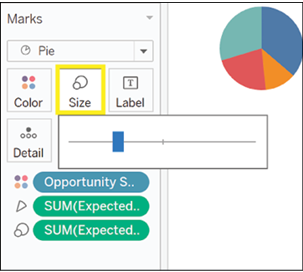
Figure 4.26: Enhancing pie chart by resizing to convey more information

We chose to make it bigger as shown in Figure 4.27:

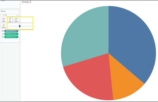
Figure 4.27: Enhanced Pie Chart

Next, we dragged Opportunity Source and Expected Amount to the Label mark so that both fields are shown in the chart in Figure 4.28:

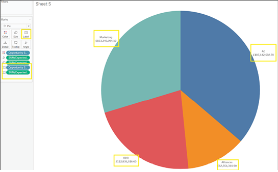
Figure 4.28: Chart displaying the next steps

On second thought, the average Expected Amount may be more informative than the total Expected Amount. Click on the first green pill in the Marks menu to change the chart from the total to the average as shown in Figure 4.29:

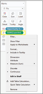
Figure 4.29: The importance of average Expected Amount for better insights

From the menu, click on Measure (Sum), as shown in Figure 4.30:

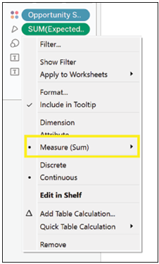
Figure 4.30: Select Measure (Sum) from the menu

Choose Average from the list as shown in Figure 4.31:

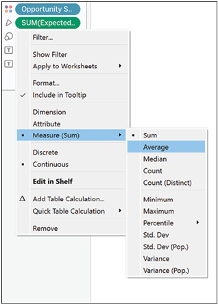
Figure 4.31: Select ‘Average’ option from the list

Repeat for all your measures as shown in Figure 4.32:

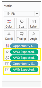
Figure 4.32: Precision and efficiency in every step

The pie chart looks much different from before as shown in Figure 4.33:

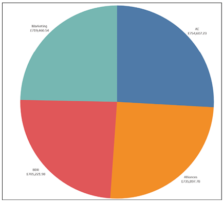
Figure 4.33: Updated pie chart introduces significant changes

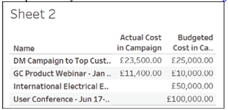
For added context, we will also add the total Expected Amount to the chart. To do so, drag Expected Amount to the Label mark as shown in Figure 4.34:

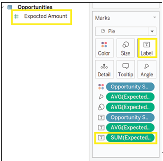
Figure 4.34: Drag Expected Amount to the Label mark for added context

However, while it may be clear to the dashboard creator what the chart shows, another user may need more information. We will therefore write what each number represents. To do so, click on the Label mark as shown in Figure 4.35:

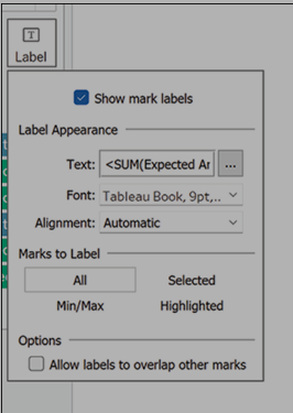
Figure 4.35: Clarify chart details by clicking on the Label mark

Click on the three horizontal dots next to Text as shown in Figure 4.36:

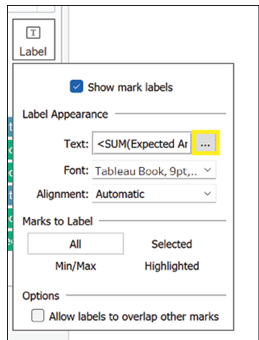
Figure 4.36: Options menu icon allows access to additional functions

A menu will open, from which you can choose how to format your text. However, you can also add more information. Here we have added in bold the definitions for all the fields shown in Figure 4.37:

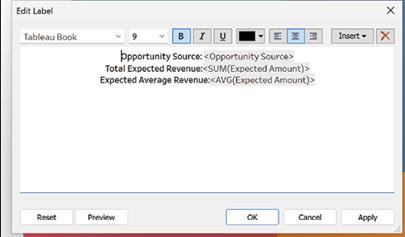
Figure 4.37: Text formatting and field definitions displayed on a menu interface

We now understand that there is not a great difference in the average expected amount that can be attributed to each source, but some sources seem to be generating more opportunities than others.

Tables in Tableau – Exploring Charts, Graphs, and Dashboards

As we proceed with our campaign analysis, we may want to understand specifically which campaigns ran over budget. In cases like this, a table may provide some useful insights. To create a table:

  1. Select Name from the list of dimensions and drag it onto Rows as shown in Figure 4.15:

Figure 4.15: Dragging the ‘Name’ dimension from the list.

  1. Select Actual Cost in Campaign and drag it onto Text in the Marks area as shown in Figure 4.16:

Figure 4.16: Adding Actual Cost to Text in the Marks area

  1. Select Budgeted Cost in Campaign and drop it onto the table’s numbers. The cursor will change and say Show Me as shown in Figure 4.17:

Figure 4.17: Selecting Budgeted Cost in Campaign and using “Show Me”

  1. Once you drop the field, your table should look as shown in Figure 4.18:

Figure 4.18: Clean and clutter-free

We can now see that it was only one of our campaigns that ran over budget. We can also see that for some campaigns, we only have budgeted costs and no actual costs. We will therefore filter them out. The quickest way to filter out a single entry is to right-click on the name you wish to filter out and select Exclude from the menu that opens up as shown in Figure 4.19:

Figure 4.19: Filtering out campaigns with budgeted costs only

You can also press CTRL and select multiple elements, then right-click on any of them and choose Exclude from the menu that opens up. This is what our campaign details looks like after filtering out the campaigns for which we have no actual expenditure amount as shown in Figure 4.20:

Figure 4.20: Filtered campaigns without actual expenditure amount

Unions – Building and Integrating Data Pipelines

It is not possible to union data using the Salesforce connector, so the steps below will only be available if you are connecting to your Salesforce data via a database connection as shown in the section Connecting to your Salesforce data in SQL.

A union works differently from the methods shown above in that, rather than adding columns from different data sources, it adds rows to existing data. In order for unions to work, all data objects must have the same structure.

The steps to perform in this case are the following:

  1. Connect to the database as shown in the section Connecting to your Salesforce data in SQL.
  2. Drag the New Union button to the main data area, as shown in Figure 3.34:

Figure 3.34: Adding a new union in Tableau

  1. A menu will open, as shown in Figure 3.35:

Figure 3.35: Creating union

  1. Drag here all the objects to be unioned. Tableau will read the structure of the first object and expect all objects to follow the same structure, as shown in Figure 3.36:

Figure 3.36: Selecting data sources to union in Tableau

  1. If Tableau encounters no problem in unioning the data, you will see the final dataset at the bottom of your screen.
  2. You can always add or remove objects by clicking on the caret on your union and clicking Edit Union, as shown in Figure 3.37:

Figure 3.37: Final unioned dataset shown in Tableau

  1. The same menu will open. From this same menu you can specify whether the field names are in the first row of your data or whether Tableau should generate field names automatically. The option to choose will depend on how your data is structured.

Conclusion

In this chapter, we have explored various methods for connecting to data in Tableau and delved into the software’s data cleaning and transformation capabilities. You have learned how to connect to Salesforce data using the Salesforce Connector and how to authenticate and configure the connection successfully.

We also discussed connecting to data that has been exported to an SQL database and highlighted scenarios where this method may be beneficial. Furthermore, we have equipped you with the skills to manipulate data in Tableau using techniques such as pivot, join, and split once the data is loaded into the software.

In addition, we have covered managing data sources in Tableau, including connecting to multiple data sources, creating data source filters, and crafting calculated fields. With the knowledge and skills gained from this chapter, you are better prepared to effectively connect to, clean, and transform data in Tableau for enhanced data analysis and visualization. This will ultimately enable you to make more informed decisions and drive impactful insights from your data.

In the next chapter, we will delve into the core functionality that makes Tableau such a powerful visualization tool.

1 Disclaimer: You may not be able to see the color of the ticks change if you have brought a paperback version of the book. However, you can access the colored version of the image at the link given at the beginning of the book.