This section aims to equip you with the fundamental knowledge and techniques needed to navigate Tableau’s interface and leverage its capabilities to create compelling visualizations. Starting with the Data Source screen and moving into the creation of various chart types, we will explore key concepts such as Sheets, Dashboards, Dimensions, Measures, and more. By understanding these foundational elements, you will be well on your way to effectively visualizing your data, from basic charts to more complex analyses. Whether you are analyzing customer data, tracking campaign performance, or exploring financial metrics, this guide provides a step-by-step approach to harnessing Tableau’s potential to uncover valuable insights hidden within your data.
Now that you have fixed your data to the best possible quality, it is time to start visualizing it. From the Data Source screen, click on Sheet 1. This is the working space where you will create your visualizations. Before we start, it is useful to get acquainted with the following terminology:
- Sheet/Worksheet: A sheet is a container for each chart in Tableau. Each chart requires a different sheet. We will use the terms sheet and worksheet interchangeably.
- Dashboard: A collection of sheets displayed at the same time covering related information.
- Dimensions: These are the categorical variables or the fields you will want to use to slice and dice your data. An example of a dimension can be color, country, name, or surname. Dimensions in Tableau, are blue.
- Measures: These are the numerical variables, that is, the actual numbers you want to show. For example, sales, number of customers, or profit. Measures in Tableau are green.
- Field: It is either a dimension or a measure. This word will be used when the dimension/measure distinction does not matter.
- Mark: Every single point in your visualization is a mark. Each bar in your bar chart, each dot in a scatter plot, and each value in a table is a mark.
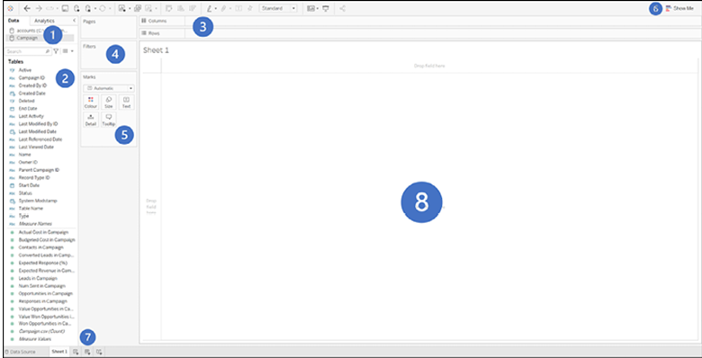
Now that we have clarified the basics let us take a look at some of the areas in Figure 4.1:
- Data: This shows the data source being used currently. When you start using several data sources across several sheets, it is always a good idea to check that the one you are using in each sheet is correct.
- Fields area: This lists all your dimensions and values, which you will use to create your visualizations. At the top, there is a handy filter box for searching a specific field.
- Columns/Rows: This is where you will drag your fields to create your visualizations. Different dimensions and measures in different columns/rows arrangements give different charts.
- Filters: Every field you use to filter your data, will be shown in this area.
- Marks: Here is where you control the aspect of your charts. From here, you can select color, size, and how your labels should look. This area will become increasingly useful as we look into intermediate and advanced charts.
- Show me: This is the menu helping beginner users create their charts. Once you stop relying on this menu, you know you will have succeeded in the task of learning to use Tableau.
- New Worksheet/Dashboard/Story: Clicking on each of these buttons will create new sheets/dashboard/stories.
- Chart area: This is where you will see your visualization. You can also drop fields in this area rather than in the columns/rows area to create charts.

Figure 4.1: Chart area: Visualize and create charts by dropping fields in this area