To create a filled map:
- Double click on the Billing State/Province field.
- Drag Expected Revenue on the Colors mark.
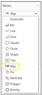
- Change the mark type to Maps, as shown in Figure 5.65.

Figure 5.65: Creating filled map
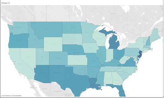
The result should look something like the map in Figure 5.66:

Figure 5.66: Final filled map visualization
We can use the tools mentioned above to zoom in and bring to the center of the view exactly the section of the map we want to show. From here we can see there is a distinct geographic pattern to the revenue we expect, with clusters of states that are close geographically and also present higher revenues.
In conclusion, this chapter has provided you with the knowledge and tools needed to create more advanced visualizations like donut charts, bar-in-bar charts, and maps. You’ve also learned how to harness the power of filters and calculated fields to customize and improve your data analysis. By following the steps outlined in this chapter, you can now dive deeper into your Salesforce data using Tableau, and more effectively communicate your insights to stakeholders.
Understanding geographical patterns, funnel analysis, and performance tracking are just a few of the many insights you can gain from the techniques discussed in this chapter. With this knowledge in hand, you can leverage the full potential of Tableau and Salesforce to make better-informed decisions for your organization. Keep experimenting with different visualizations and techniques as you continue to explore these powerful tools and uncover new insights into your data.
In the next chapter, we will move on to discussing advanced topics for visualization with Tableau.