A useful case for Salesforce and Tableau is to compare sales performance across time and against a target. To showcase this, we will create a bar-in-bar chart that tracks the Expected Amount for each Opportunity Owner.
In the following example, User table has been added to the Opportunities standard connection in order to show the names, rather than the IDs of the opportunity owners. We will now proceed to build the bar-in-bar chart, using the following steps:
- To start with, drag First Name to Rows, as shown in Figure 5.45:
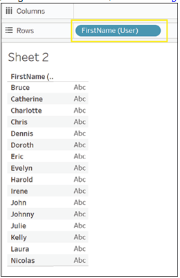
Figure 5.45: Adding First Name to Rows shelf
- Next drag SUM(Expected Amount) to Columns, as shown in Figure 5.46:
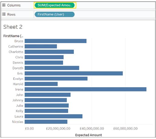
Figure 5.46: Adding Expected Revenue to Columns shelf
We want to choose only Opportunities that relate to Q1 2022 or Q1 2023. Furthermore, for Q1 2022, we only want to look at Closed Won Opportunities.
We will, therefore, use a calculated field to look only at relevant opportunities. To add the calculated field, follow these steps:
- First, use one of the methods shown in the previous section to create a new calculated field. In the window that opens, we will write:
([Fiscal Year]=2023
AND
[Fiscal Quarter]=1)
OR
([Fiscal Year]=2022
AND
[Fiscal Quarter]=1
AND
[Stage]=”Closed Won”) - Then we will give it a name, say Relevant Opportunities.
- Finally, we will click on OK, the final result is shown in Figure 5.47:
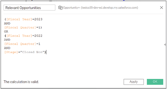
Figure 5.47: Creating relevant opportunities calculated field
- Now that the field has been created, drag it onto the Filters card and select True from the menu that opens, then click OK, as shown in Figure 5.48:
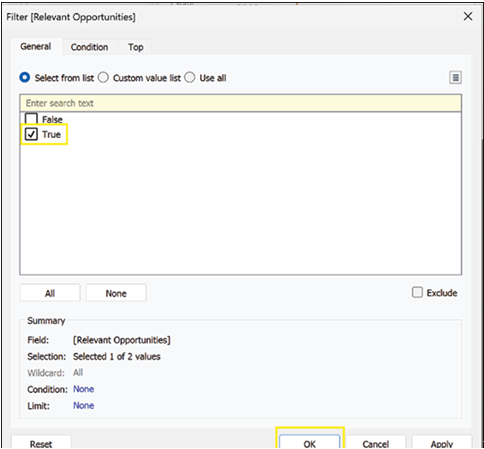
Figure 5.48: Filtering data to relevant opportunities
- Tableau will now filter all the opportunities to show only the ones that meet our criteria, as shown in Figure 5.49:
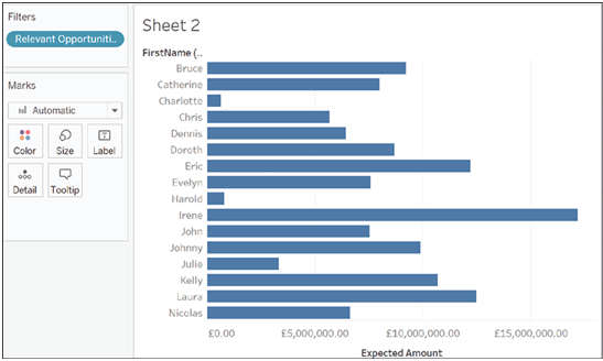
Figure 5.49: Data filtered to specified opportunities
- Now drag the Fiscal Year to the Size mark, as shown in Figure 5.50:
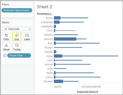
Figure 5.50: Adding Fiscal Year to Size mark
- Drag the Fiscal Year to the Color mark, as shown in Figure 5.51:
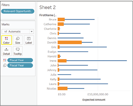
Figure 5.51: Adding Fiscal Year to Color mark
- Right now, Tableau is putting the amount for 2022 after the amount for 2023, but that is not what we want for a bar-in-bar chart. To change that, click on the Analysis menu at the top of your screen, as shown in Figure 5.52:

Figure 5.52: Accessing Analysis menu
- Click on Stack Marks in the menu that opens now, as shown in Figure 5.53:
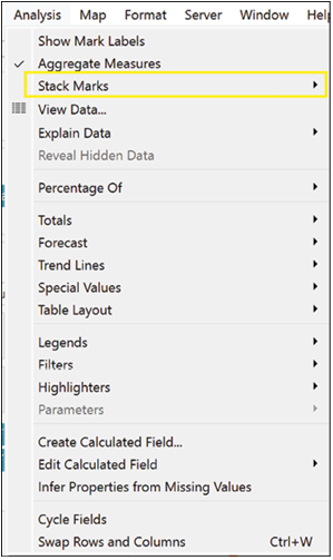
Figure 5.53: Turning off Stack Marks option
- Select Off, as shown in Figure 5.54:
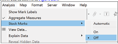
Figure 5.54: Stack Marks set to Off
- Your bar chart should look something like the chart below, as shown in Figure 5.55:
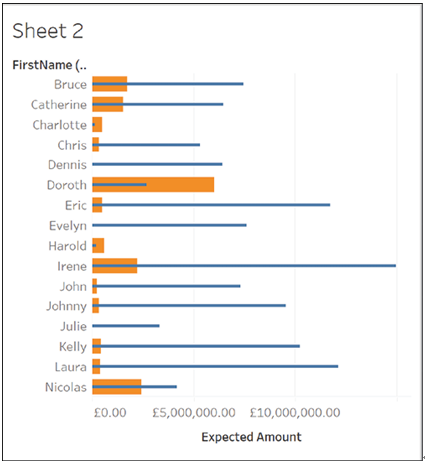
Figure 5.55: Final bar-in-bar chart
- As you can see, Doroth and Charlotte’s performance this year is better than last. Everybody else, however, seems to be having a much tougher time.