We can convey several layers of information by using maps in Tableau. We started in the previous chapter with a simple filled map, and we will now take it one step forward by looking at the number of accounts and the revenues on the same map.
Before we do so, you will have to upload some additional data to your org that is required for this visualization. First, download the files available at the GitHub repository for the book.
Now follow these instructions to load the opportunities:
- Login to Salesforce and navigate to the ‘Setup’ area by clicking the gear icon in the upper right corner.
- In the Quick Find box, type and select Data Import Wizard.
- Click on the Launch Wizard button within the Data Import Wizard.
- Select the type of object that matches your CSV data, such as Opportunities for opportunity data.
- Click on Choose a CSV file, browse to your tfs_opps.csv file, and upload it.
- Review the field mappings. The wizard will try to auto-map CSV columns to Salesforce fields. Adjust manually if necessary.
- After verifying the field mappings, click Next.
- Review your import settings in the summary page and click Start Import.
- Monitor the import progress. Salesforce will indicate when the import is complete.
- Once the import is complete, check the relevant object in Salesforce, like Opportunities, to ensure the data is correctly imported.
- Review any error reports generated by Salesforce and address any issues highlighted.
Repeat this process for the tfs_accs.csv file, the Account object, the tfs_users.csv file, and the Users object.
For this chart, the Account object was used as a primary data source, and the Opportunity object as a secondary data source. Please refer to Chapter 3, Building and Integrating Data Pipelines for details on how to blend data sources.
To create our map, follow these steps:
- Double-click on the Billing State/Province field (from the Accounts object). This will create a map, as shown in Figure 6.49:
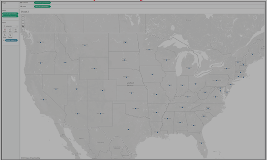
Figure 6.49: Add Billing State to view
- From the Marks menu, change the mark type to Circle, as shown in Figure 6.50:
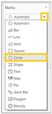
Figure 6.50: Change mark type to circle
- Right-click on Account ID and drag it onto the Size card, choose Count Distinct from the menu that opens, as shown in Figure 6.51:
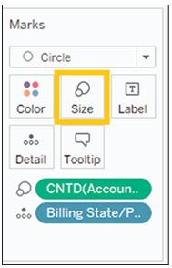
Figure 6.51: Size by Account count
- From the Opportunity object drag Expected Amount to Color (make sure to have set the blend correctly), as shown in Figure 6.52:
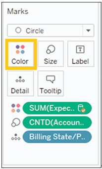
Figure 6.52: Color by Expected Revenue
- Click on the Color card, then choose Edit Colors, as can be seen in Figure 6.53:
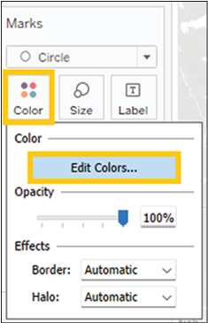
Figure 6.53: Edit colors
- Choose the Red – Blue Diverging palette, as shown in Figure 6.54:
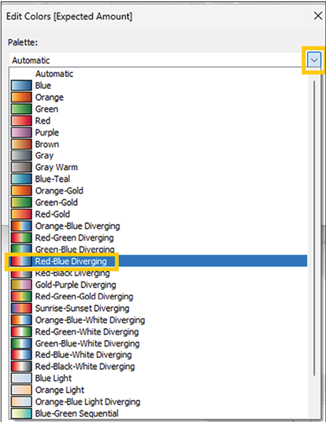
Figure 6.54: Change color palette