- As usual we want to make it more informative. We will start by dragging our measure in the Label menu for our white pie chart, as shown in Figure 5.15:
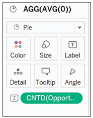
Figure 5.15: Adding measure to label mark of main pie chart
- We will repeat the same step, but for the other menu, as shown in Figure 5.16:
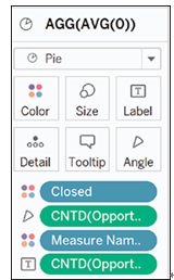
Figure 5.16: Adding measure to label mark of secondary pie chart
- Next we will hide both axes, as they are not needed for our chart. To do so, right click on your left axis, and a menu will open, as shown in Figure 5.17:
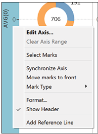
Figure 5.17: Right clicking on vertical axis to access menu
- Click on Show Header, as shown in Figure 5.18:
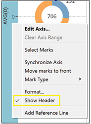
Figure 5.18: Selecting “Show Header” option to hide axis
- To remove all unnecessary lines from the chart, click on Format at the top of your workbook and then on Lines, as shown in Figure 5.19:
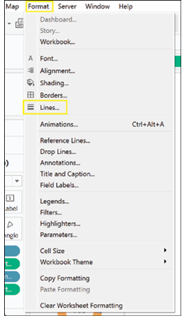
Figure 5.19: Accessing Format | Lines menu
- The Format Lines menu will open, as shown in Figure 5.20. Open each menu and select None. Repeat this step for the Sheet, Rows and Columns menu:
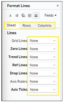
Figure 5.20: Setting line formatting to None
- If you want to also remove the border lines, click on the square icon and select None, as shown in Figure 5.21, for all the menus in Sheet, Rows and Columns:
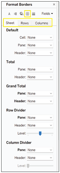
Figure 5.21: Removing chart border lines
- Your donut chart should look, as shown in Figure 5.22. In the center, you can see the full amount and next to each slice, its relative amount.
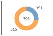
Figure 5.22: Final customized donut chart
- We can also change the absolute amounts into percentages. To do so, we select the menu for our colorful pie chart and click on the measure we have previously added to the Labels mark, as shown in Figure 5.23:
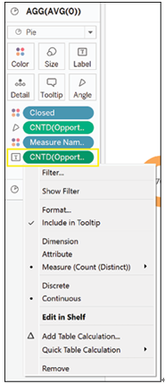
Figure 5.23: Selecting measure pill
- Click on Add Table Calculation. A new menu will open, as shown in Figure 5.24:
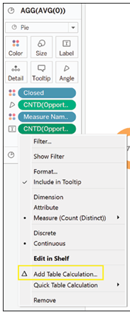
Figure 5.24: Adding table calculation
- In the menu that opens, select Percent of Total from the Calculation Type menu, as shown in Figure 5.25:
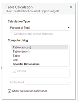
Figure 5.25: Setting calculation to Percent of Total
- The absolute numbers have now changed into percentages, as shown in Figure 5.26:
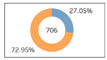
Figure 5.26: Measure values converted to percentages
- It is possible to have both percentages and absolute numbers by dragging your measure on the Label mark in the colored pie menu, as shown in Figure 5.27:
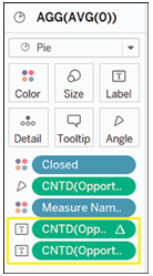
Figure 5.27: Adding second measure pill for both values
- To further aid comprehension, we will add the dimension to the Label as well, and proceeded to format the menu as shown in Figure 5.28:
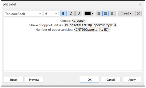
Figure 5.28: Formatting label marks
The final donut chart should look similar to the one in Figure 5.29:
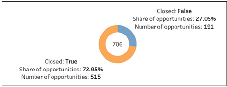
Figure 5.29: Final informative donut chart