The previous example shows that sometimes the full extent of our analysis can only be achieved by comparing several charts. However, we would not want our users to keep switching back and forth between tabs to follow our conclusions. This is where Tableau’s dashboard functionality comes in handy.
To create a dashboard, click on the New Dashboard button as shown in Figure 4.53:

Figure 4.53: Clicking on ‘New Dashboard’ button to create a dashboard
This is the dashboard area. It displays the following as shown in Figure 4.54:
- Preview menu: This menu allows you to see how your dashboard will look on different devices.
- Size: From here, you can choose your dashboard size among a list of preset ones or define your own.
- Sheets: From here, you can choose which sheets to drag to the dashboard.
- Objects: From here, you can choose additional objects like images and text boxes to add to the dashboard.
- Layout: The layout tab allows you to finetune the way your dashboard looks.
- Dashboard: It is the actual dashboard, your canvas on which you will add your charts.
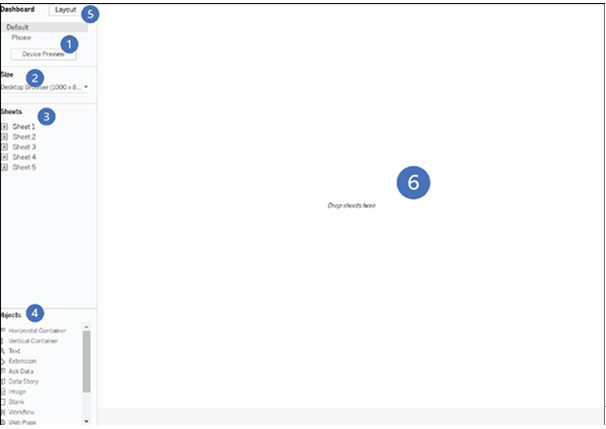
Figure 4.54: Turning data into visual insights on your dashboard
To add a sheet to the dashboard, select it from the sheets list, drag it, and drop it onto the dashboard as shown in Figure 4.55:
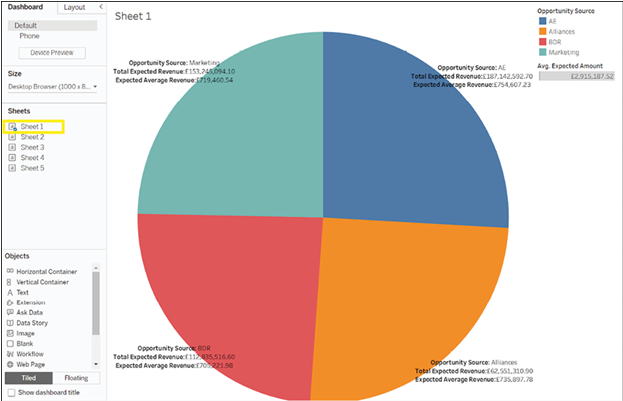
Figure 4.55: Adding a sheet to the dashboard by dragging and dropping from the sheets list
As you can see, Tableau has added the chart so that it takes the entire dashboard and added on the right a color and size legend. Now add the second chart on the right of the first one. Tableau will grey out the area which will be covered by your chart as you drag it as shown in Figure 4.56:
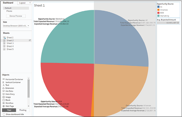
Figure 4.56: Tableau dashboard with enlarged chart and size legend, ready for placement of second chart
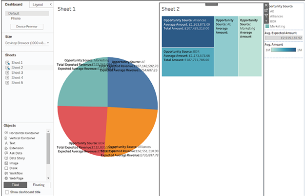
Next, add your third chart underneath the first one (Figure 4.57) as shown in Figure 4.58:
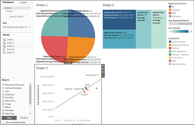
Figure 4.58: The third chart is added below the first chart
Finally, add your last chart, in the bottom right quadrant as shown in Figure 4.59:
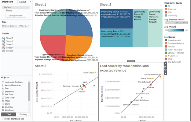
Figure 4.59: Bottom right quadrant chart added as final touch
This dashboard is not particularly informative therefore some adjustments are required. First, the size should be increased to obtain more space to work with. To change size, click on the Size menu as shown in Figure 4.60:
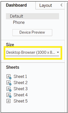
Figure 4.60: Adjusting dashboard size for enhanced working space
Click on Desktop Browser (1000 x 800) as shown in Figure 4.61:
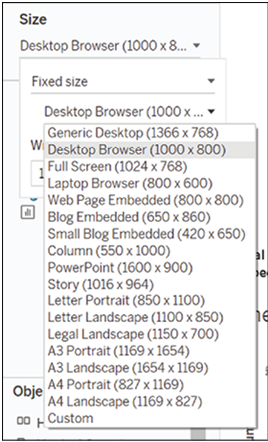
Figure 4.61: A desktop browser displayed on a screen
Choose your preferred size. Here, we have chosen Generic Desktop, as shown in Figure 4.62:
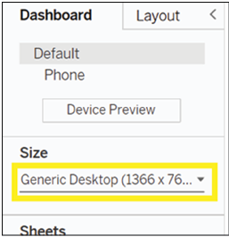
Figure 4.62: Selecting Generic Desktop size for customized experience
You can also alter the Width and Height values directly to your preferred values, as shown in Figure 4.63:
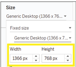
Figure 4.63: Customize dimensions effortlessly by directly inputting preferred Width and Height values
Next, we will add the dashboard title by clicking on the Dashboard menu as shown in Figure 4.64:

Figure 4.64: The Dashboard title is added by clicking on the Dashboard Menu
And we will click on Show Title as shown in Figure 4.65:
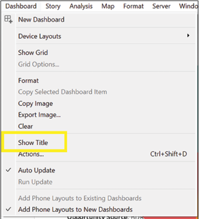
Figure 4.65: Click “Show Title”
Dashboard 1 is not a very insightful title. To change a title, double-tap on it, to open a menu as shown in Figure 4.66:
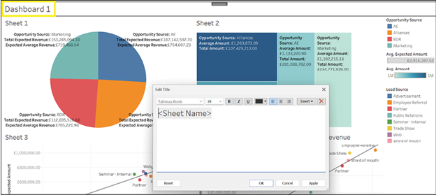
Figure 4.66: Changing the title of Dashboard 1 using the menu.
Type in your desired title as shown in Figure 4.67:
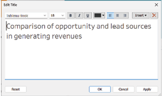
Figure 4.67: Title input field on a digital screen
Click on OK as shown in Figure 4.68:
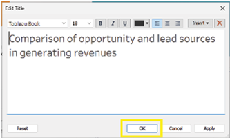
Figure 4.68: Confirming user action with a simple click of ‘OK’
Following the same method, we will change the titles of each chart as shown in Figure 4.69:
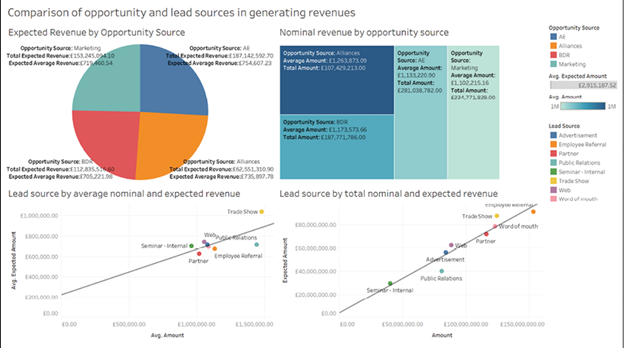
Figure 4.69: Chart titles undergo transformation with consistent approach
Since we have added labels to all my charts, the legends are unnecessary, so we will remove them to give more space to my charts. To do so, click on a legend as shown in Figure 4.70:
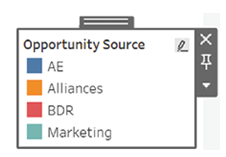
Figure 4.70: Removing legends to create more space for charts
Next click on the x button in the top right corner, as shown in Figure 4.71:
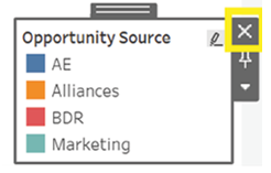
Figure 4.71: Closing the opportunity score popup
Repeat for all the legends you do not wish to show. The dashboard looks more professional now, as can be seen below:
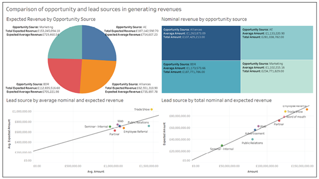
Figure 4.72: Dashboard with hidden legends
Your users can now see all your charts at a glance and quickly absorb the knowledge you wish to impart.