The easiest way to create pie charts and tree maps in Tableau is to use the Show Me menu (an alternative way to create pie charts will be discussed in the next chapter). For this example, we will be using the Opportunities data which can be found under the Standard Connection tab in the data menu as shown in Figure 4.21:
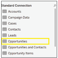
Figure 4.21: Tableau’s Show Me menu simplifies the creation of diagrams
| Disclaimer: Pie charts become hard to read when they are split into more than two categories, and the same information can be represented in other charts, which take up less screen space, so please use them sparingly. |
To start, double-click on Opportunity Source in the Dimensions menu as shown in Figure 4.22. Tableau will automatically add it to Rows.
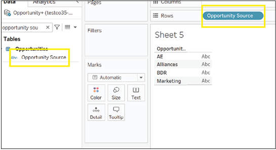
Figure 4.22: Opportunity source
Next, double-click on Expected Amount. Tableau will automatically add it to the Label mark as shown in Figure 4.23:
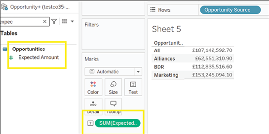
Figure 4.23: Tableau adds Expected Amount to Label mark.
Finally, click on the Show Me menu and select the pie chart visualization from the menu as shown in Figure 4.24:
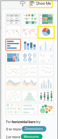
Figure 4.24: Choosing the pie chart from the Show Me menu
Tableau will now create a pie chart for you, as shown in Figure 4.25:
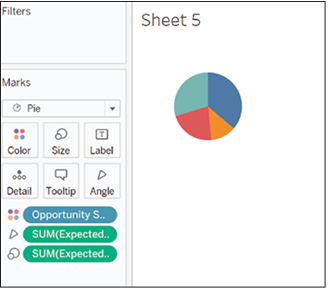
Figure 4.25: Tableau effortlessly creates a pie chart
However, this pie chart is not very informative, so let us try and add more information. Clicking on the Size mark will allow us to resize the pie chart as shown in Figure 4.26:
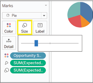
Figure 4.26: Enhancing pie chart by resizing to convey more information
We chose to make it bigger as shown in Figure 4.27:
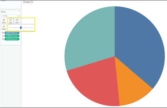
Figure 4.27: Enhanced Pie Chart
Next, we dragged Opportunity Source and Expected Amount to the Label mark so that both fields are shown in the chart in Figure 4.28:
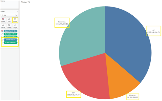
Figure 4.28: Chart displaying the next steps
On second thought, the average Expected Amount may be more informative than the total Expected Amount. Click on the first green pill in the Marks menu to change the chart from the total to the average as shown in Figure 4.29:
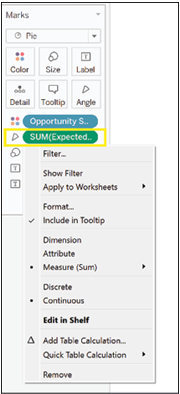
Figure 4.29: The importance of average Expected Amount for better insights
From the menu, click on Measure (Sum), as shown in Figure 4.30:
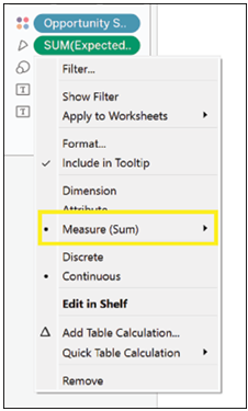
Figure 4.30: Select Measure (Sum) from the menu
Choose Average from the list as shown in Figure 4.31:
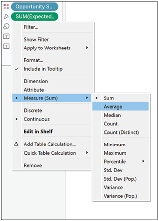
Figure 4.31: Select ‘Average’ option from the list
Repeat for all your measures as shown in Figure 4.32:
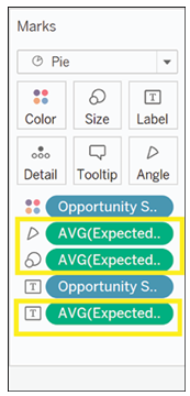
Figure 4.32: Precision and efficiency in every step
The pie chart looks much different from before as shown in Figure 4.33:
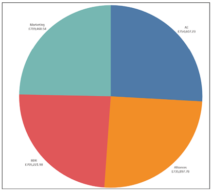
Figure 4.33: Updated pie chart introduces significant changes
For added context, we will also add the total Expected Amount to the chart. To do so, drag Expected Amount to the Label mark as shown in Figure 4.34:
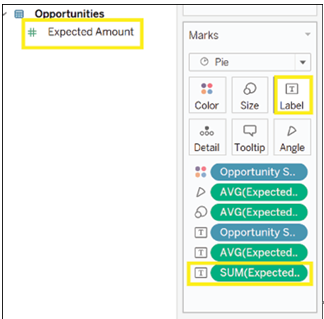
Figure 4.34: Drag Expected Amount to the Label mark for added context
However, while it may be clear to the dashboard creator what the chart shows, another user may need more information. We will therefore write what each number represents. To do so, click on the Label mark as shown in Figure 4.35:
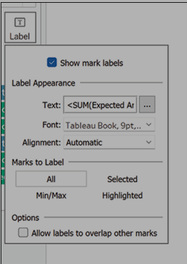
Figure 4.35: Clarify chart details by clicking on the Label mark
Click on the three horizontal dots next to Text as shown in Figure 4.36:
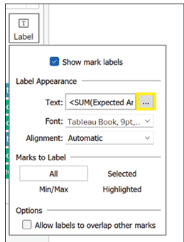
Figure 4.36: Options menu icon allows access to additional functions
A menu will open, from which you can choose how to format your text. However, you can also add more information. Here we have added in bold the definitions for all the fields shown in Figure 4.37:
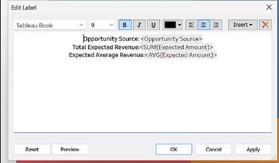
Figure 4.37: Text formatting and field definitions displayed on a menu interface
We now understand that there is not a great difference in the average expected amount that can be attributed to each source, but some sources seem to be generating more opportunities than others.